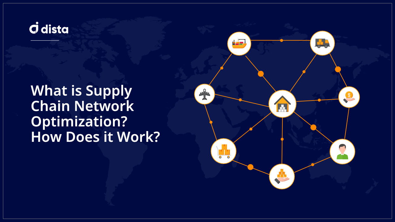
Introduction
With the dawn of 2021, we had initiated the massive redesign exercise of our existing platform. our location intelligence platform, was operational for various customers for over 3 years by then and was growing rapidly featurewise. The Saas platform in the making was in a reactive phase, responding to the shifting market requirements. When the pandemic hit, we had a breathing chance, where we could at least think about the redesign and hence the entire redesign phase was initiated. I was the only designer (UX, graphic, motion, you name it) and hence the responsibility fell on my shoulders.
Roles I Played
I was the UX generalist for the company and hence, I was a lead on the research phase as well. We as a team by then had 20 different customers and 9 different modules. These modules were designed to fit into each other, making this entire system like Lego blocks. We could assemble the modules, customize them and ship them as a perfect fit for the customer requirements. I had a go ahead to hire a UX research intern for this project and so I began the journey of the most comprehensive research exercise I had ever undertaken.
Timelines
The entire research and analysis phase lasted for about 5 months.
1. Setting up: 15 days
Establishing the research goals, internal stakeholder interviews, support staff interviews, establishing methods that will work during remote research.
2. Expert reviews and heuristics: 15 days
Recruiting the industry UX experts, providing them with the KT and asking them to review the product
3. Actual user interviews: 1 month
Shortlisting the clients with a high volume of support calls, Understanding and categorizing the queries, Recruiting the actual users for the remote interviews and conducting them.
4. Secondary research: 1 month (overlapping with the interviews)
Analyzing competition products, documenting features, reverse engineering the interfaces into simple block diagrams.
5. Interview analysis: 1.5 month
Going through all the recorded interviews one by one, again and again, to find out the problems (both intrinsic and extrinsic), documenting the problems, problem categorisation, problem ranking, effort prioritization and establishing task flow mental models.
6. Refining persona: 1 month
Refining the personae definitions based on the data collected, problems faced by the users and increasing complexity of the product, mapping the modules and finer details to each persona, reimagining the task flows for the new persona based on the constraints.
7. Early sketching sessions: 15 days
Based on the insights derived from the research phase, rapid block diagram sketching for both web and mobile apps.
Stakeholder Approvals for the Project
Getting buy-in for the redesign, especially with almost one-year timelines needs buy-in from all the stakeholders. We began the process by identifying and documenting the usability issues in the product. The resulting document was a major factor in tipping the scale towards the full redesign exercise.
Another important factor to consider was google analytics and the insights it provided us. We observed that there were a lot of sessions of short durations, without any navigation. People were reaching their desired pages on the Platform from the home page and were not moving much. Since SaaS platforms mostly charge on user activities, it was essential to find out why users were not visiting the other modules/pages in the Platform.
The next thing we also realized from the tracking was limited visits to the dashboards. This meant that the dashboards were not found to be useful by the users. This was the core of the entire product and it was essential to find out the reason why users were moving away from what we considered to be the CRUX of the platform.
Research Goals
The goal we had to achieve was very straightforward. From the volume of the support calls, it was obvious that the users were getting stuck somewhere. The issues could be technical or usability issues, but either way, they were hampering the experience.
We wanted to understand the way users were using our products and compare it with what they thought was during the development phase. We also wanted to understand the tools they have been using apart from ours and see if we could match the level of user satisfaction achieved by other tools. We conducted our first trials with the newly hired interns to establish a baseline for a new user. In short, our goals were to;
1. Understand the way people are using the platform and the products built on top of it.
2. Understand user frustrations, pain points and barriers while using the same
3. Understand if the features are being effectively used and if not, the reasons behind them
4. Understand why users are not using the tools that we considered would be essential for effective usage.
5. Get a sense of what other tools users are using and how much they like/dislike those tools.
6. And most importantly, mind the allocated budget.
Methodology
Expert Reviews
There is a universal problem of the users getting used to a product if it is enforced by their managers. This phenomenon usually hinders the ability of prolonged users to objectively evaluate the product under scrutiny.
The way I structured the expert reviews was to get an instance, give a brief introduction about the domain and then ask the experts to perform a heuristic evaluation of the module under discussion. While using the severity in reverse order (severity 4 gives you 0 points, severity 1 gives you 3) a 30 point scorecard was established and minimum passing criteria was set to 24. The charts were plotted to identify the weaknesses of the system and work on them. My wife, Sarita Chaudhari helped here as one of the outside experts and provided her evaluations.
Actual User Interviews
Since everyone in the world was under lockdown, we had to get slightly creative with our process. There were no options to call the users into our office and interact with them while they used the products. Neither was the option to be present in their own work environment and observe them while they worked on the Platform. So we decided to go with the MS-teams interviews with the talk aloud method with shared screens, where users can tell us what they were thinking while we observe what they were doing on the screen. Now, this method is not as effective as the in-person study, but this was the best solution, given the circumstances.
To establish the baselines, we started interviewing the new recruits, fresh out of orientation about their thoughts on the platform. We would ask them to do a few tasks that were designed to cover a lot of ground across the platform. This helped us establish a pattern and key pain points, where we need to improve the platform UX for the new users.
Then we interviewed our developers and the project managers who created this platform. We asked them questions like why this feature was developed, what were the thoughts while creating this feature and how would an ideal user use it. This allowed us to extract the assumptions made while deciding upon the key task flows.
Most of our actual user base is not well versed in communication and prefers to work from behind the scene. During our dry run, we also realized that people were not really talking aloud unless they were prompted to. There was a risk of breaking the chain of thought for the users. So we decided to go another way. We literally asked the recruited users to ‘teach’ us the way they use the product. This way we were sure that they would keep talking throughout (without prompting) the interview process. This also allowed us to see if they are the power users and if they were, they could guide us to what shortcuts to build for them. By using the word ‘teaching session’ in the notes, we gave them a sense of relaxation, which was much needed to get the most out of these interviews.
At the end of each session, we asked the recruited users questions that were not covered during the teaching session. This allowed us to cover the entire questionnaire and get all the necessary insights from the scheduled interviews.
Recruitment Criteria
When it came to recruiting the users for the study, we had to compensate for the remote study. Hence we decided to go all out and recruit as many users as possible. Since everyone was working remotely, we had to be on our toes. First, we shortlisted the clients who would agree to spare their time for our benefit. This was done with the help of our account managers and senior management. Overall we got a nod from a few clients and we started our next steps of shortlisting the right candidates for the exercise. Few of them even suggested the people we should talk to for a better understanding of the problems. As a result, we got a lot of actual users, who have been using our system. Then we decided to shortlist them on the basis of their experience (one user with the highest amount of experience, one with the least and then others in between if they are using the same module). We restricted our number of users to 5 per client.
Then we prepared a questionnaire asking about their level of expertise with the platform, their role, hours spent each day etc in the beginning. After the ice-breaking sessions, we started the so-called teaching session. It was challenging to keep asking the questions any newbie might ask, so we went back to the studies conducted with the new recruits and got inspired by the questions they were asking. We dedicated the maximum time to this exercise and tried our best to keep the questions free-flowing. We ended our conversation by asking them for their overall rating for the platform and talking a bit about the other products they use and their opinions about the competition.
While interviewing the mobile app users, which constitutes the majority of our user base, we had to change the strategy. Instead of asking them to teach us the app, we went with the traditional questions and answers. We also included questions to understand the environmental factors and responses to notifications sent by our system. Overall, the mobile app users were content with the app, except for the navigation.
Secondary Research
While we were busy chasing the users to get a chance to talk to them, we decided that the waiting time is best utilized in doing our secondary research. This included finding out about the competition from the marketing team, visiting their sites, observing what features they have in their products and reverse engineering them into simple blocks that we can enhance and include in our own designs. In short, stealing like an artist 😉!
We went through all the competitors for each product line the product managers had in their minds and started reading about their process, their blogs about the new features they had introduced or were going to introduce. We also tried to go to youtube/Vimeo to see if we could find tutorial videos about how to use these products. We gathered whatever information we could and kept it ready for inspiration.
Analysis of the Issues
While we were conducting all the interviews, it was important that we convert the words spoken by the test subjects and the actions performed by them into tangible inputs that can get plugged into the redesign phase. To do that we tried listening to all the recordings of the interviews and started jotting down all the usability issues spoken by the users. We even documented what they liked, what they hated and how much they hated it. This gave us an idea about what users want. Now we were ready to find out what users needed.
To do that we marked approximately at what points in the video timelines, what points were being discussed. We kept this handy and turned off the volume. Now we were watching the videos without any interference of sound. This helped us identify all the misclicks, extra mouse travels made, the hesitations and everything that was not as obvious as users stating their problems. This helped us track the mouse travels and the troubles users faced while accessing the small buttons. We made the reruns of the videos with and without sound to make sure that we have not missed anything. This also helped us narrow down the way users perform the tasks, their mental model and potential spaces where we could introduce shortcuts for the power users.
We started writing the issues down for each user into an excel sheet and immediately started writing the most likely cause of it. Then we started categorizing them even further based on the frequency of occurrence and severity of the issue. The small auditory cues like sighs helped us capture the intensity of the frustrations caused by the issues. We also added a column named impact, where we measure the impact of the issue in terms of user abandonment, longer wait times and overall effectiveness of the tool. We then combined all the issues related to one customer (in turn, one product line) and then decided to start solving them one by one. The resultant sheet started looking something like this;
Output and Deliverable
The insights we got from the overall exercise were beyond expectations. At the end of the exercise, I knew the following about the redesign
1. What has been working! If it is working, why it is working and how are users using it.
For example, the task module status update is almost instantaneous and it gets labelled in red if the task is about to go bad. Users found it very helpful
2. What are the learning curves for each of the modules that we had developed and published
For example, our reporting engine was very powerful but slightly difficult to use. Also the operations were under an icon. Very few users actually did take efforts to learn them.
3. What does not work! What users don’t want to see.
For example, in the reporting module, there are multiple tables indicating the field agent statuses. Users only care about the ones that are not performing.
4. What modules/features have never been used by the users.
For example, we had designed a beautiful map-based live dashboard. Out of many users we interviewed, only a select few had seen it.
5. What kind of interfaces the users prefer and why do they prefer them
For example, many users were transferred from legacy software and they preferred the excel like look, while the younger generation showed interest in the clutter-free UI. Both, however, were interested in having all possible actions and options visible to them.
6. The boundaries of the roles were fading and we had to come up with a new set of personae
For example, there was a new role, where the managers of the field agents are also in the field and they need to access the mobile application as well as the manager dashboard. This gave rise to what we call the mobile office today.
7. How our field agents are using the apps and under what conditions.
Field assets have to respond to the notifications almost instantly. So most of the time, they use the phone with one hand while they are carrying something in the other. This made accessing the traditional hamburger menu extremely difficult.
8. And the list continues…
All this data was delivered (to me again) in the form of google sheets as mentioned above. All the insights were tagged, categorized and were ready for cross-reference. Meanwhile, all the data compiled from the secondary research was also put on a Miro board and was ready to be accessed. We also managed to cross-reference the excel sheet entries with the inspiration board, so that we can easily identify what block first where during the concept development phase.
Overall Impact
After the research part was over, it was time to take a long hard look at the personae, IA and the task flows.
Personae
As mentioned before, the platform journey started with a simple use case of delivering food. There were limited complexities and the roles were clearly defined. We started off with only 4 major persona groups;
1. Admin: These users would be tech-savvy and will configure the system for the customer, add users and manage the way reports are generated
2. Managers: These were the governance team, who took care of the field agents and managed daily operations.
3. Agent: These users were the on-field operatives and would carry a mobile app, which can receive the tasks from the central team and send back the updates and live location
4. Strategists: These users were rare and would play more in the data analysis field. These users can monitor everything, generate reports on the desired activities and plan the next steps
While performing the research activities, we realized that these roles are no longer valid and the boundaries between them are fading away. The mobile offices were getting more and more mainstream and were required by the managers who were present on the field. So we started looking at the data and came up with 9 different personae types, subdivided into four verticals of the platform offerings. This resulted in a set of 36 pseudo personae, that we could start assigning module-level operations to.
The nine identified personae types were
1. Agents: same as above
2. Field managers: Users who were managers as well as agents
3. Backend users: Users who bulk upload jobs, manage inventory, create individual tasks, maintain day to day activities etc
4. Dispatch: Users who are responsible for assigning tasks to agents and seeing them through
5. Regional managers: Users who deal with long term planning, approve expenses, generate reports to share with CXOs and indulge in strategy planning and data visualization. Have CRUD access to users
6. CXOs: Only interested in MIS insights. However, they can see whatever they want if they log into the system.
7. Strategists: Power users who have access to all the operational data and can perform their analysis and visualizations to plan the road ahead. Also, have access to the way reports will be shown to the Backend/ dispatch / regional manager type users
8. IT Admins: The users who configure the system, set tones and set roles
9. Customers of our clients: the users who have access to screens inside the platform, but in a limited capacity like tracking a rider or visiting e-commerce shop items
Considering the growing complexity of the platform, the modules were also subdivided into 4 SOMI verticals namely;
1. Operations: Day to day activities, mostly related to short-lived tasks
2. Management: slightly long term activities like user addition, hub addition etc
3. Selling: the inventory management side of the platform
4. Insight: core visualization, analysis and reporting engines.
Task Flows
With the new understanding of the personae, data on user frustrations and our secondary research, we started designing the new task flows. Every task flow was plotted from a users’ perspective, based on the products of their liking and analysis of the few of the competitors. Each task for each persona was optimized and rewritten with clear copy.
Information Architecture
The earlier version of the platform was driven by left-hand side navigation. Every context switch required a mouse to travel to the left-hand side panel, hover on the required icon, wait for the floating sub-menu to appear (this takes 300ms but it is frustrating). Many times, menu items belonging to the same module could have remarkably similar icons, which in turn made the floating sub-menu more frustrating. Those 300ms compounded over 3 to 4 attempts, you can imagine! A Similar case was happening with the mobile UI as well
With the new personae in place, we got the freedom to restructure this into a much cleaner river cell. We performed a bit of broad categorization to clean up the top-level navigation. We also made attempts to create different yet interconnected buckets of the modules to make the system more user friendly.
With this arsenal of this information, the next phase of concept generation began!
Note – The blog is written by Aashutosh Kulkarni, Principal Product Designer, Dista. It has already been published on his personal blog.